Many common accessibility issues begin long before any code is written. At each stage of the process, understanding the accessibility concerns that sit within your role can prevent a lot of extra work and expense later on. This will also mean that compromises between accessibility concerns and the visual coherence of a design are made by the person best placed to do this – the designer.
1 Colour Contrast
To give people with visual impairments the best experience, ensure all the text on your website contrasts sufficiently with the background, to make it easy to read (aim for a 4.5:1 contrast ratio).
If using text over an image or video, be aware that at different screen sizes and different default font sizes the text may overlap different parts of the image, and check that you will still be able to read the text clearly wherever it is positioned. Consider tinting the image or adding a background behind the text to make sure the contrast is high.
For important non-text elements, such as the border around form fields, look for a contrast ratio of at least 3:1 against the background.
2 Fonts
Choose clear, easy to read fonts, especially for the body content. The default font size you use should be large enough that it’s easy to read. Since website visitors can change the default font size in their browser, remember that the amount of space each piece of text takes up could increase significantly, so make sure any areas of your design containing text have room to grow.
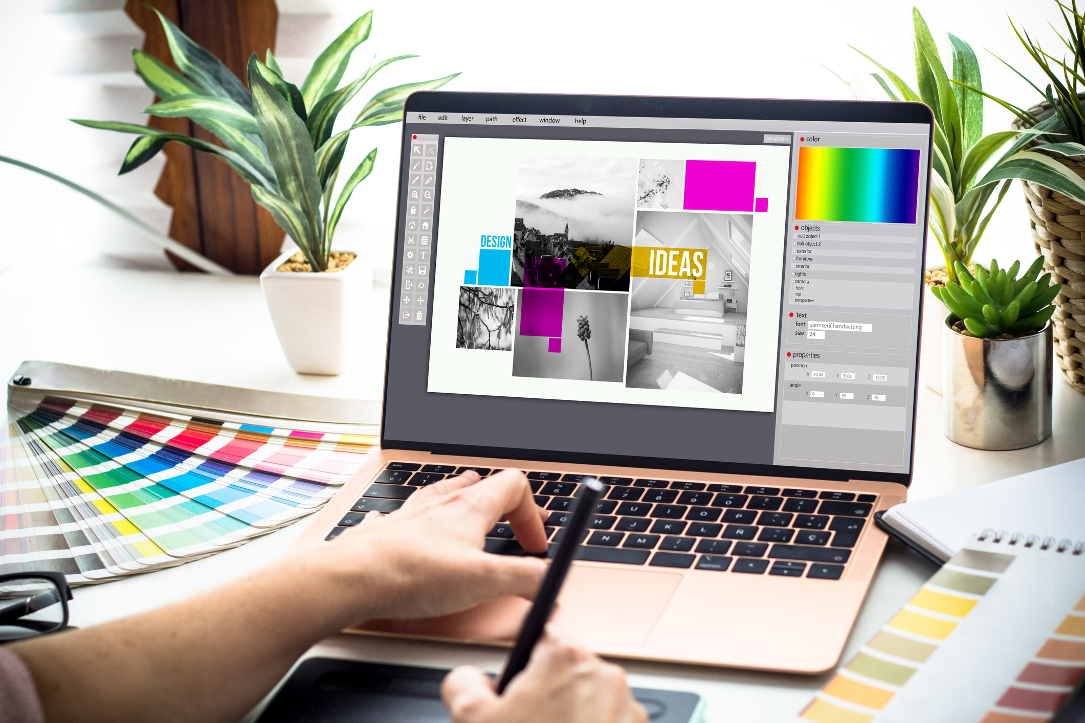
3 Use of Images
Images and icons can help break up blocks of content on a page, providing a visual break for users, and can help support meaning and aid scanning of the page, plus make it easier for users to find a piece of information again later as they can offer visual landmarks. These help everyone, but are especially useful for users with dyslexia and other cognitive differences, who may rely more on visual structure. Images may also benefit users with ADHD, who might struggle to focus on long uninterrupted block of text.
Since it is often the role of the designer to choose images and icons for a site, at least initially, it’s worth considering at this stage what the purpose of an image is, to make sure visually impaired users can get the same information and experience. For instance, if a stock photo is used just to break up a page and add some visual interest, there is a fair chance it’s not adding any concrete information itself, so this is an image that could be marked as purely decorative.
However, if you have photos taken of the actual people, places or products you are looking at, consider if there is anything you can get from looking at an image that you might not get from the surrounding text. For example, there could be a lot you could learn from looking at a photo of team members, beyond what you would get from just their name and job description. If you make the design decision to add team photos, you could consider also asking those staff members for a visual description of themselves in the photo to use in the alt text.
4 Highlights for Keyboard Users
Some people have difficulty using a mouse, for example if they have tremors or pain in their hands, and may prefer to navigate through a website using the keyboard. Keyboard users often move through interactive element (links, buttons, form fields etc) using the tab key.
To make it clear where you are in the page, every interactive element should have a focus style, which clearly highlights that item, so keyboard users don’t get lost. Considering this focus style at the design stage means it can best complement the look of the site, rather than leaving it to default styles at the development stage.
The focus style is often a ring or border around an element which clearly shows it is highlighted. Make sure that any focus style you design is clear and contrasts well against the background (at least 3:1 contrast ratio).
5 Avoiding Conveying Information Only Through Colour
Check that you aren’t relying only on colour to give information, as this will be difficult for colour-blind users. The most common place this occurs is with links – just changing the colour of the text isn’t enough to show it can be clicked. The most widely recognised option is to add an underline to your links, so colour-blind users can easily pick them out of the text on the page. Be careful not to use underline for anything else, such as headings that are not links, as this could create confusion for users.
Making Accessibility Part of the Design Process
Visual design decisions shape how accessible a website can be from the start, and addressing tis early makes it easier to balance usability, aesthetics, and compliance throughout the project.
If you’d like support reviewing designs with accessibility in mind, or guidance on where accessibility responsibilities sit across your design and content processes, feel free to get in touch.